Introduction
Soft shades have a unique ability to make a space feel peaceful, welcoming, and effortlessly stylish. From cozy living rooms to trendy fashion collections, pastel colors continue to influence modern design in ways that feel timeless rather than temporary.
These delicate shades create an atmosphere that feels lighter, calmer, and more refined. Whether used in interior design, clothing, branding, or event styling, pastel tones bring balance without overwhelming the senses.
What makes pastel shades so appealing is their versatility. They can look romantic and vintage, sleek and contemporary, or playful and artistic depending on how they’re combined. This flexibility explains why designers continue to return to them year after year.
What Are Pastel Colors?
Pastels are soft, muted versions of brighter colors created by mixing a color with white. The result is a lighter tone that feels airy and soothing.
Popular pastel colors include:
- Blush pink
- Mint green
- Lavender
- Powder blue
- Peach
- Butter yellow
- Soft lilac
- Pale coral
These shades are often associated with calmness, creativity, comfort, and elegance.
Why Pastels Feel So Relaxing
Color psychology plays a major role in how we experience interiors and visual design.
Soft hues naturally reduce visual intensity, which creates a more peaceful atmosphere. Unlike bold saturated tones, pastels feel gentle and less stimulating.
This makes them especially effective in bedrooms, nurseries, wellness spaces, and minimalist interiors.
The Difference Between Pastels and Bright Colors
Bright colors demand attention immediately, while pastels create subtle visual harmony.
For example:
- Bright red feels energetic and dramatic
- Soft blush pink feels romantic and calming
- Neon green feels vibrant and loud
- Sage pastel green feels earthy and serene
This softer effect allows pastels to work beautifully in layered and balanced designs.
Why Pastel Colors Remain Timeless
Design trends come and go, but pastels consistently reappear in interiors, fashion, and branding.
One reason pastel colors remain popular is their ability to adapt to changing aesthetics.
A Perfect Balance Between Neutral and Colorful
Pastels offer more personality than plain neutrals while still maintaining softness and sophistication.
This balance allows homeowners and designers to add color without making spaces feel overwhelming.
Pastels Work Across Multiple Design Styles
Pastel shades complement a wide variety of aesthetics, including:
- Scandinavian interiors
- Modern minimalist homes
- Vintage-inspired decor
- Coastal design
- Contemporary fashion
- Cottagecore styling
Because they’re so adaptable, they rarely feel outdated.
Emotional Comfort and Warmth
Soft tones often create emotional comfort.
During periods when people seek calm and simplicity, pastel palettes become even more appealing because they promote relaxation and visual softness.
Using Pastel Colors in Interior Design
Pastels can dramatically transform the mood of a room.
Whether you want a subtle accent or a fully coordinated palette, understanding how to use pastel colors effectively helps create more balanced interiors.
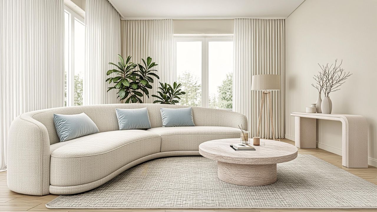
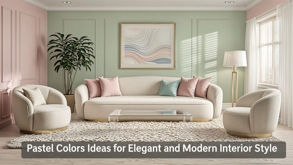
Living Rooms With Pastel Accents
A pastel living room feels open, airy, and welcoming.
Popular combinations include:
- Soft pink with beige
- Mint green with white
- Powder blue with light wood
- Lavender with gray
Adding pastel pillows, rugs, curtains, or artwork introduces color gently without overpowering the room.
Bedrooms That Feel Relaxing
Bedrooms are ideal spaces for softer shades because they naturally encourage rest.
Popular pastel bedroom ideas include:
- Sage green walls
- Blush bedding
- Pale blue curtains
- Cream and peach accents
Layering textures like linen, boucle, and cotton helps these spaces feel even cozier.
Kitchens With Subtle Color
Pastel kitchens are becoming increasingly popular in both vintage and modern homes.
Pastel cabinetry, backsplashes, or appliances can create a charming and unique atmosphere.
Soft mint refrigerators and pale pink cabinets remain especially popular in retro-inspired kitchens.
Best Pastel Color Combinations
Combining colors thoughtfully is essential for creating harmony.
Some of the most elegant interiors use carefully layered pastel colors that complement each other naturally.
Pastel Pink and Gray
This pairing creates a modern and sophisticated atmosphere.
Gray balances the sweetness of pink while maintaining softness.
Mint Green and White
Fresh and clean, mint green works beautifully in kitchens, bathrooms, and minimalist spaces.
White keeps the palette bright and uncluttered.
Lavender and Beige
Lavender introduces subtle elegance while beige adds warmth and grounding.
This combination works especially well in bedrooms and cozy reading spaces.
Peach and Cream
Peach tones add warmth and energy without becoming too bold.
Combined with cream, they create a soft and welcoming atmosphere.
Pastel Colors in Fashion and Personal Style
Pastels aren’t limited to interiors. They also continue to dominate fashion collections and seasonal trends.
Many people love pastel colors because they feel effortlessly stylish and flattering across different skin tones.
Why Pastels Work So Well in Fashion
Pastels create a softer and more approachable appearance compared to darker or highly saturated colors.
They’re especially popular during spring and summer because they feel fresh and lightweight.
Popular Pastel Fashion Trends
Some timeless pastel fashion staples include:
- Oversized lavender sweaters
- Mint blazers
- Blush pink dresses
- Powder blue suits
- Pale yellow accessories
These pieces often feel elegant without looking overly formal.
Combining Pastels With Neutrals
Pastels pair beautifully with:
- White
- Beige
- Gray
- Cream
- Soft brown
Neutral tones help pastel outfits feel balanced and sophisticated.
The Psychology Behind Soft Color Palettes
Color influences mood more than many people realize.
One reason pastel colors remain so popular is their emotional impact.
Calmness and Relaxation
Soft shades reduce visual tension and create a sense of ease.
This explains why wellness brands, spas, and calming interiors frequently rely on pastel palettes.
Creativity and Optimism
Pastels often feel playful and imaginative.
Creative spaces like studios, cafes, and boutique stores frequently use softer palettes to inspire comfort and artistic energy.
Warmth Without Intensity
Unlike bold colors that can sometimes feel overpowering, pastels create warmth in a more subtle and approachable way.
This makes them easier to live with long-term.
Decorating Tips for Using Pastels Successfully
Using softer shades effectively requires balance.
Too many pastel tones without contrast can sometimes make spaces feel overly delicate or washed out.
Add Texture for Depth
Texture prevents pastel spaces from feeling flat.
Combine:
- Woven fabrics
- Wood accents
- Matte ceramics
- Natural stone
- Linen textiles
These materials add warmth and dimension.
Use Contrast Thoughtfully
Adding black accents, darker woods, or metallic finishes creates balance.
This contrast helps pastel palettes feel more mature and refined.
Avoid Overmatching
Not every item in a room needs to match perfectly.
Layering complementary shades creates a more natural and designer-inspired appearance.
Pastel Colors in Modern Branding and Design
Businesses increasingly use softer palettes to appear approachable, calming, and contemporary.
From packaging to websites, pastel-inspired branding feels modern yet welcoming.
Why Brands Use Pastels
Pastels often communicate:
- Creativity
- Calmness
- Sophistication
- Wellness
- Simplicity
This makes them especially popular among lifestyle, beauty, wellness, and fashion brands.
Digital Design Trends
Soft color gradients, pastel backgrounds, and minimalist layouts continue to dominate modern web design.
These visual styles feel cleaner and less visually exhausting.
Social Media and the Pastel Aesthetic
Pastel aesthetics remain incredibly popular on platforms like Instagram and Pinterest.
Soft palettes photograph beautifully and create visually cohesive feeds.
Common Mistakes When Decorating With Pastels
Although pastels are versatile, there are still design mistakes to avoid.
Using Too Many Similar Shades
Rooms can feel monotonous if every pastel tone blends together without enough contrast.
Adding neutrals and textured materials helps create definition.
Ignoring Lighting Conditions
Natural light changes how pastel tones appear.
Some shades may look cooler or warmer depending on the room’s lighting.
Testing paint and fabric samples before committing is always a smart idea.
Overloading Small Spaces With Color
Even soft colors can feel overwhelming if overused.
Balancing pastel accents with neutral backgrounds keeps rooms feeling fresh and spacious.
FAQ
What are pastel colors?
Pastel colors are soft, muted shades created by mixing brighter colors with white to create lighter tones.
Why are pastel shades so popular?
They create calming, elegant, and versatile aesthetics that work well in fashion, interiors, and branding.
Which pastel colors work best together?
Popular combinations include blush pink and gray, mint green and white, lavender and beige, and peach with cream.
Are pastel colors only for spring?
No. While popular in spring, pastels can work beautifully year-round depending on how they’re styled.
Can pastel colors work in modern homes?
Absolutely. Minimalist and Scandinavian interiors frequently use pastel tones for softness and warmth.
Do pastel colors make rooms look bigger?
Yes. Lighter shades reflect more light, which can make spaces feel brighter and more open.
What materials pair well with pastel interiors?
Natural wood, linen, stone, matte ceramics, and woven textures complement pastel palettes beautifully.
Are pastel colors suitable for professional branding?
Yes. Many modern brands use pastels to appear calm, creative, approachable, and sophisticated.
Conclusion
Pastels continue to captivate designers, homeowners, and creatives because they offer the perfect combination of softness, elegance, and versatility. Whether used in interiors, fashion, branding, or everyday decor, these gentle shades create spaces and styles that feel welcoming rather than overwhelming.
The beauty of pastel palettes lies in their flexibility. They can feel modern and minimalist, warm and nostalgic, or artistic and playful depending on how they’re layered and styled. By balancing soft hues with texture, contrast, and thoughtful design choices, it’s possible to create environments that feel timeless and effortlessly sophisticated.
From calming bedrooms to stylish wardrobes and beautifully curated living spaces, pastel tones continue to prove that subtle color can have a powerful impact. When used intentionally, they create a sense of harmony that feels both comforting and visually inspiring.